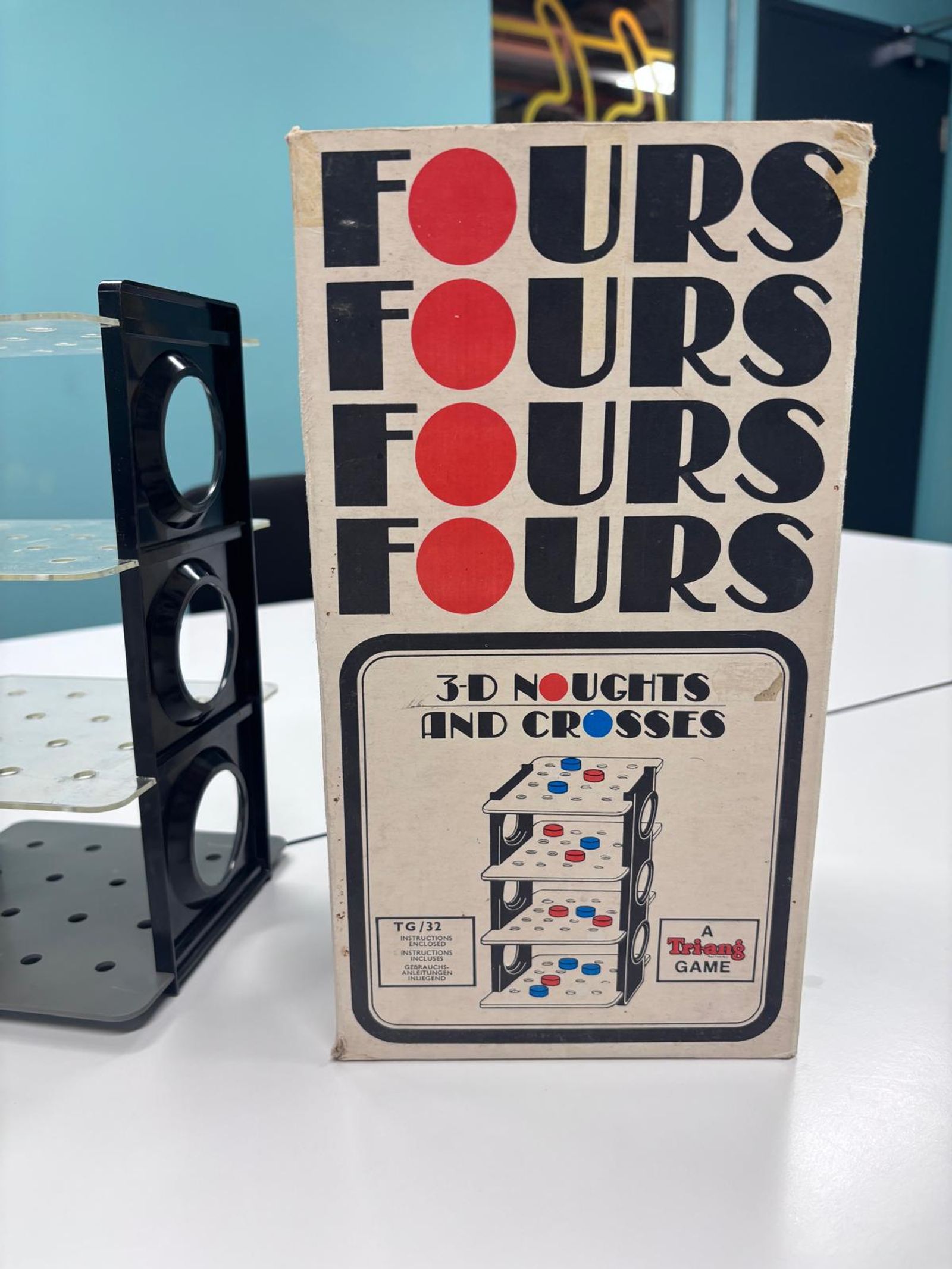
Show & Tell: 3D Naughts and Crosses
This week Katie is sharing a vintage version of the game Naughts and Crosses that drew her attention across at a local carboot because of its graphical, simplistic design and bold colours.
Written by Katie Moore
2 March 2026

This is a transcript of one of our weekly, studio show-and-tells.
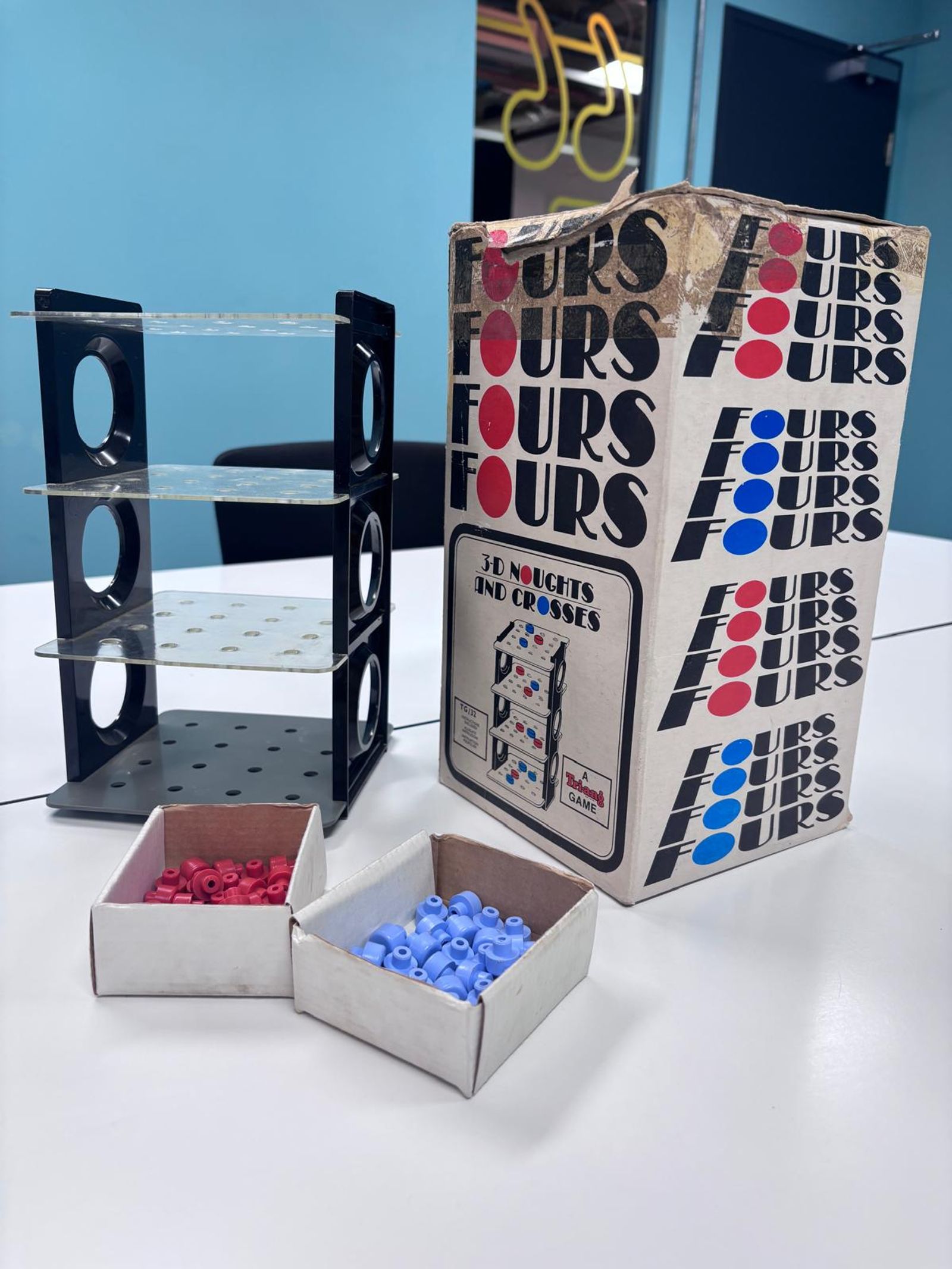
It’s printed in 3 colours, which is cheap to produce, but that's why it's so impactful as it has a limited palette. It's like they haven't had any budget to do much beyond the tech illustration, which is probably done for the manufacturing. And I love that. The designer is trying to convey the idea of four of something. How do we make people feel like it is 3D? We put it on a plane. It's very simple but really impactful. I guess it is called Fours as it has four tiers.
This is my type of design. I just love bold minimalism. And it made me think about how, if it was manufactured nowadays, it would be designed. There's no way it would speak to you the way this design does. Imagine that on the shelf at a toy shop. Although, the reality of that is, it would have far more presence. But instead the default thing would be a picture of a couple of kids playing, boy and girl, maybe with a parent in the background. It's like just a standard way of doing that stuff. Or it would be some sort of cartoony character and a photo of the game which is a shame as it loses the genuine graphic design beauty. You probably also have a bunch of disclaimers on the box these days.

I walked past and I was like no, I need to go back and get this. Its graphical design and bold colours stood out to me, I was intrigued to see what it was.
Discussion
Katie: The typeface is interesting too, it's a bit gatsby with a slight 20s kind of style, sort of jazz.
Alex: That'll be solid inks as well, not made up of four colours. That's another reason it feels nice and bold. It's literally 3 inks. And these days they will probably produce that with 4 colour processes so those colours wouldn't look as nice.
Lauren: I don't know if it's the paper or just because it's aged, but the box is off white which helps it all.
Lauren: So what were you out looking for? Did you have one eye on appealing visual stuff?
Katie: No, we go for something to do in the morning. And I just like poking around looking at things. I just gravitate towards things that stand out. I'm so surprised because this was one of the last stalls that we went to. Like, how has nobody picked that up?
Alex: I wonder if this is a one off or a limited edition, because it's for the design centre or if it is the kind of thing that's still considered in the middle of the time.
Take away
I think a thing to learn from this is when you hit a creative wall and you can't make anything work visually, often taking stuff out is the best route. I don't naturally do that. I naturally would design maximalist but actually when you go, okay, how would this work if it's just shapes and three colours? You end up doing something that will work in the simplest terms. But there's a real balancing act because it still needs a lot of personality.