Show & Tell: House of Leaves
This week Alex shows us a book called House of Leaves. It's a weird story that's told from two different perspectives. A story about a story that is depicted in the reading experience.
Written by Lauren Williamson
1 Apr 2026

This is a transcript of one of our weekly, studio show-and-tells.
The plot of the book is that there's this young guy called Johnny Truant who's upstairs neighbour is an old man who is a bit of a hermit and a bit of a hoarder. This old man dies and the landlord pays Johnny Truant to go and clear his flat, and in doing so he finds his life's work writing a critique of a film called The Navidson Record.
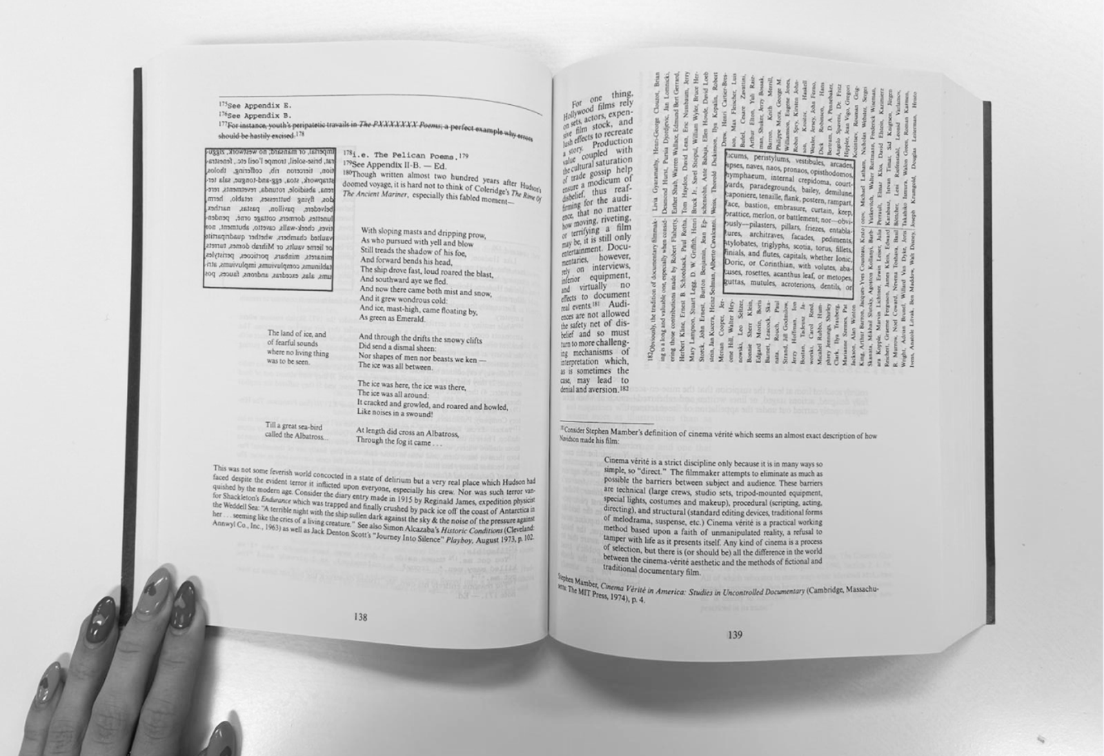
The Navidson Record is a documentary film that is about a family who live in a house in New England, the father is an architect, and it's a big baroque colonial house in the New England countryside. One morning, the father wakes up and there's a doorway in a wall that wasn't there the day before. It's an external, so the other side of that wall is the outside. But opening the doorway, there is a corridor and there's no corridor on the outside of the house. It's going somewhere. And then the whole thing unfolds, the father becomes obsessed with this corridor and eventually starts going in. A kind of exploratory mission into this corridor, deeper and deeper into what is like a labyrinth. It's quite odd. But it's all written from the perspective of the old man writing a critical review of this.
Then we have Johnny Truant in footnote form, writing about his understanding of this story and his own life, and he is kind of mentally unravelling. So you've got a kind of unreliable narrator on top of what is clearly a bizarre and weird story.
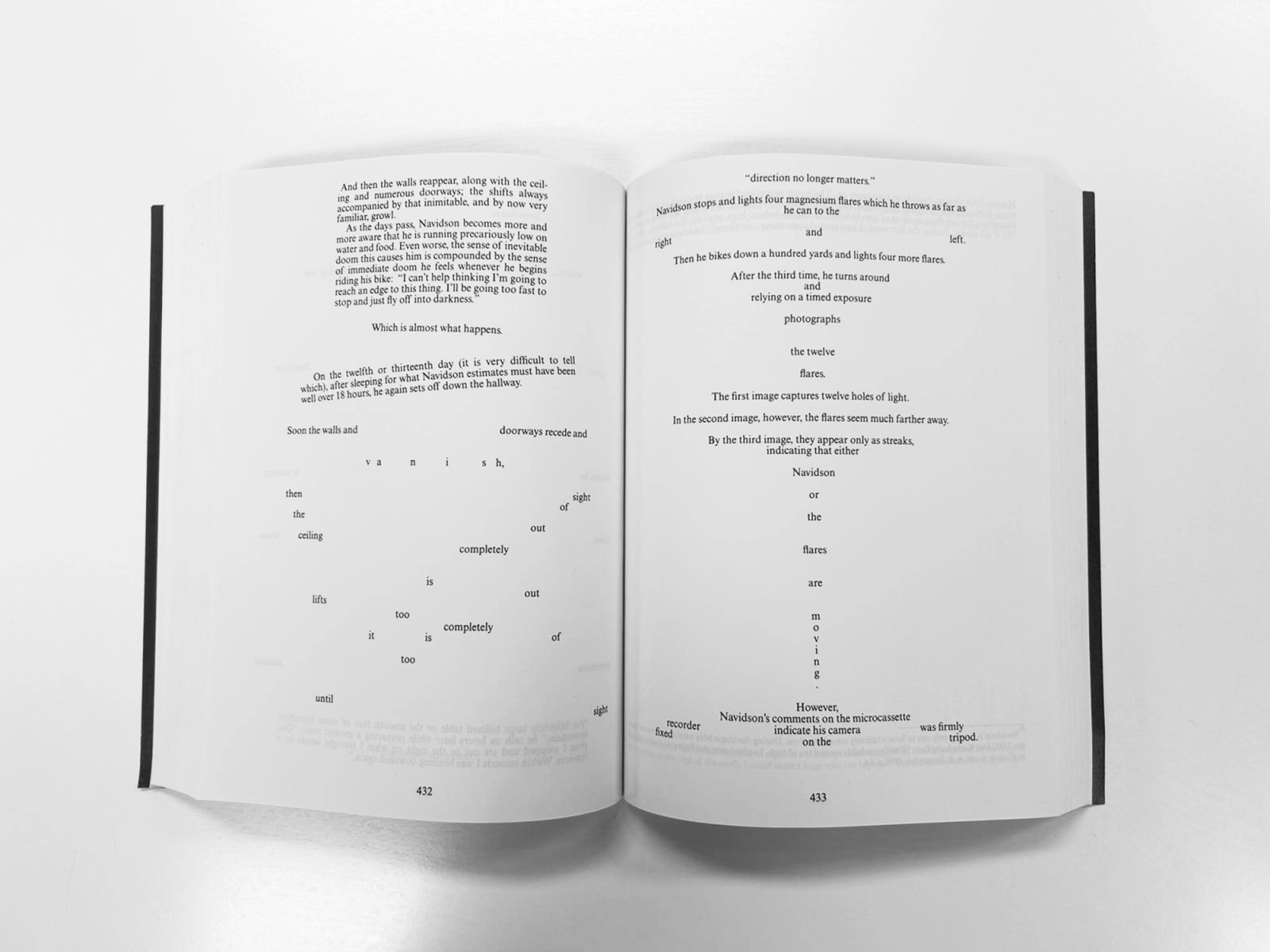
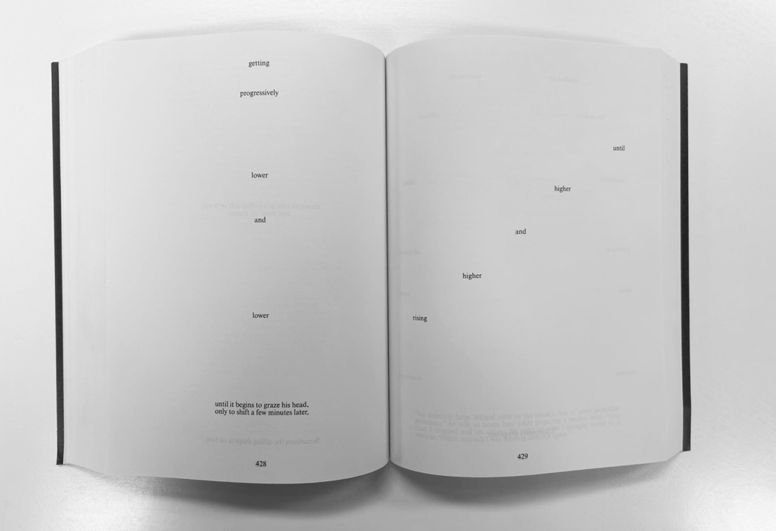
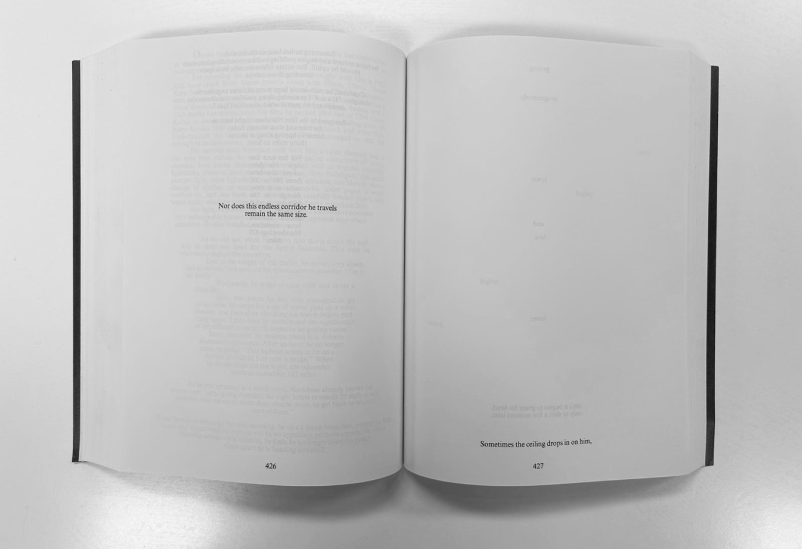
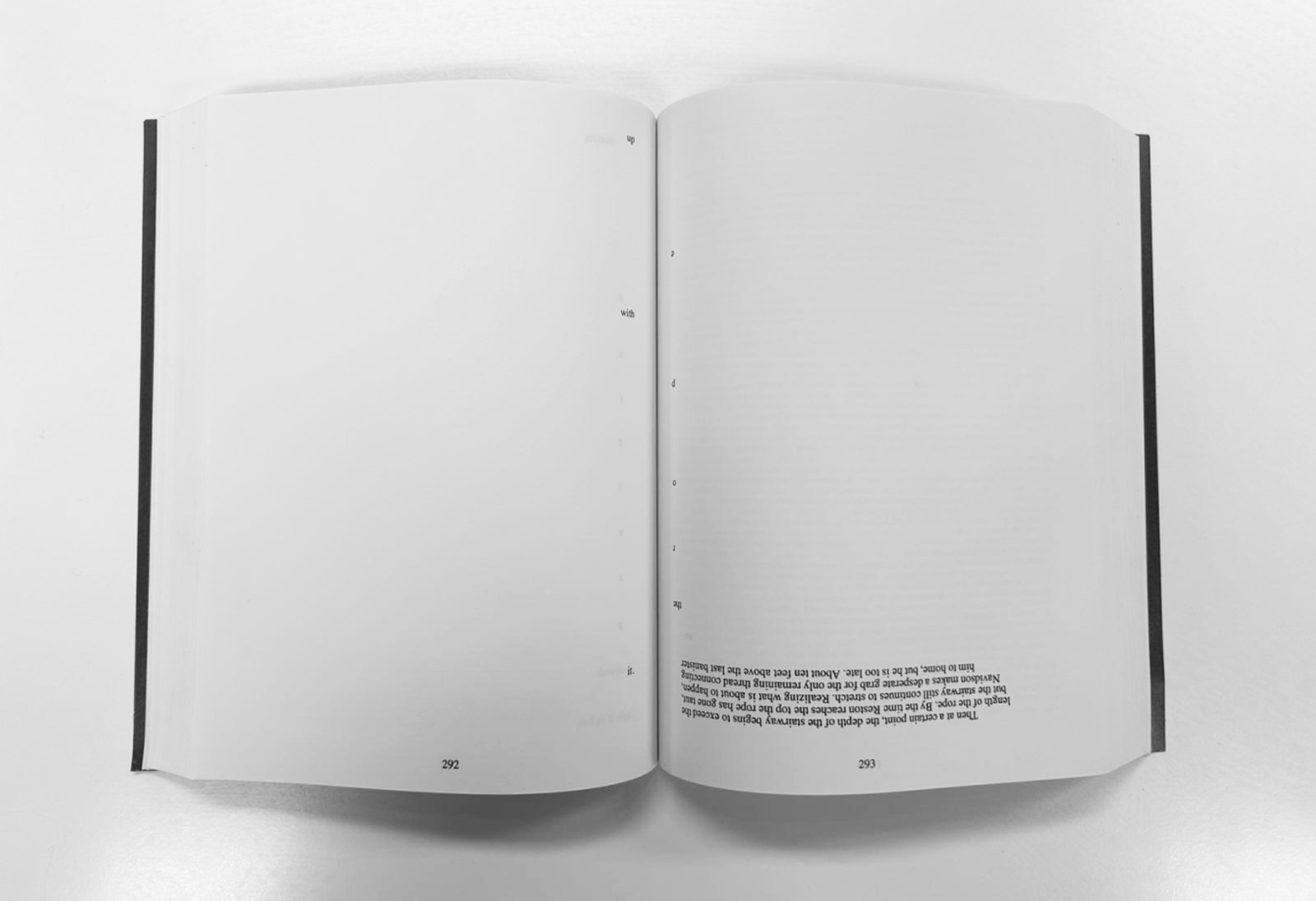
What is interesting about this, beyond the story, which I think is interesting anyway, is the way it's produced. So, the typography of this book alters with the story and how the story's told. Sometimes that's just simply about how much the page is in use. But as you progress through the book, things start to get very odd in terms of how you read and you're forced to move the book. Confusion starts to become part of the experience of reading and that is expressed in all sorts of different ways that get odder and odder, and then sometimes it breaks off into something that feels completely disconnected, like certain poems.
There's a particular section, as the story gets more weird and troubling, so does the typography. It forces you to change the way you're reading all the time and get closer and get further away from the page, moving the book. And then there's instances where, in the story, you’ve got action happening that is kind of frightening or horrific and the type alters to that. There's a great section where he's being chased in the maze under the house by something, and he doesn't know what it is and the number of words on the page reduces and reduces and reduces, you end up going faster, faster, faster, faster, so you're kind of running from the story.
It's an extraordinary work, just from the fact that somebody has designed almost every page of the book in line with the story. And it's mass produced, so this is still a typeset book that is in print and this is not the original edition. You can see what's happened over time, that they've had to reduce the cost because it's such an expensive thing to produce. The paper has gotten cheaper, and this image on the cover is awful considering that the book is so interesting.
Another interesting section is when you initially venture down the corridor, it seems to go on forever and then eventually reaches a spiral staircase that goes down into a massive empty space that's dark, but he doesn't know where anything is. On those pages where he's in that space, the text is very expansive. And then he goes into the corridors and it reduces and reduces.
So the point is, you sort of lose the reading of it in the way that he's losing his threat in this place and he's unravelling. It’s quite hard to read but kind of pleasurable because there's a sort of discovery element. The best way is to read the top line narrative stuff, and then go back and read the Johnny Truant stuff. But you realise that the Johnny Truant stuff is about somebody who's slowly losing their mind so this could just be a reflection of that. It's not really about anything he's found, it's just about his own mental state and being lost in his own head.
It is quite literal, I suppose, but it makes for a totally different reading experience than anything else I've ever seen. It absorbed me totally in the horror of what the character’s going through which is awful, haunting, disorientation, darkness, confined space and spaces that are... unpleasantly expansive. It’s the type of book you need to commit to for a couple hours, at least, to let yourself be absorbed in it because of the way it makes you adjust your reading and understanding of this story, and it's the progressive nature of the unravelling of somebody.
It was designed this way, the writer wrote it for this purpose. He knew how he wanted it designed. This is not a thing that was written straight and given to a designer. Anyway, I suppose I look at that as an enormous effort of design, an incredible example of how powerful layout can be. What a challenging thing for a publisher to take on as well.
Discussion
Katie: It's making me uncomfortable just flicking through it.
Alex: Yeah, it's hugely effective, right?
Lauren: Stresses me out to be honest.
Alex: Yeah, totally, these are the kind of design things we often talk about like when we’re doing layout and you go ‘that's a bit uncomfortably close’. That's what I mean. It's not natural, is it? It's an unnatural way of reading. It breaks a contract.
Katie: Yeah. That's what it does. When you open a book, there's a sort of unspoken, or in fact, when you look at a website, there's an unspoken contract. The way things are gonna work, right? With a book you know which way the book opens, which way up it is, and you know what the 1st word is, you know what chapter change goes like. And there's a reason for that.
Lauren: Yeah, Structure is important. It's about the user experience because you want people to be in the story and not concerned with that architecture. This is totally the opposite.
Katie: I wonder if it was intended to not be read properly. I mean, if it is intended to be read properly, they put up a lot of obstacles.
Alex: I certainly think that the intention is to make you feel as disconcerted as the characters feel. I think it's definitely designed to unsettle and be difficult and sort of put you in the frame of mind of somebody who's losing theirs.
Lauren: Which is an extraordinary thing to do with letters on a page.

I think it's definitely designed to unsettle and be difficult and put you in the frame of mind of somebody who's losing theirs.