Webbs of Holt
- Brand
- Visual identity
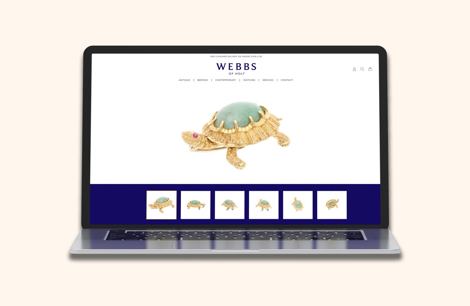
- Website design
- Art direction & photography
Webbs came to Outthought as an already highly regarded and well-established business with a fiercely loyal customer base. Despite this enviable status, the Webb family felt that a wider prospective clientele was within reach but simply didn’t know about the exceptional artisanal service they provide, comparable to some of the highest-profile independent jewellers in the world.
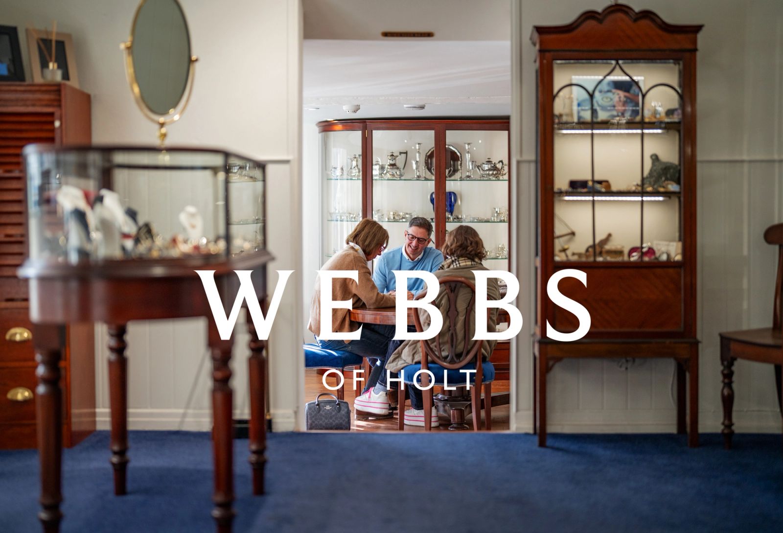
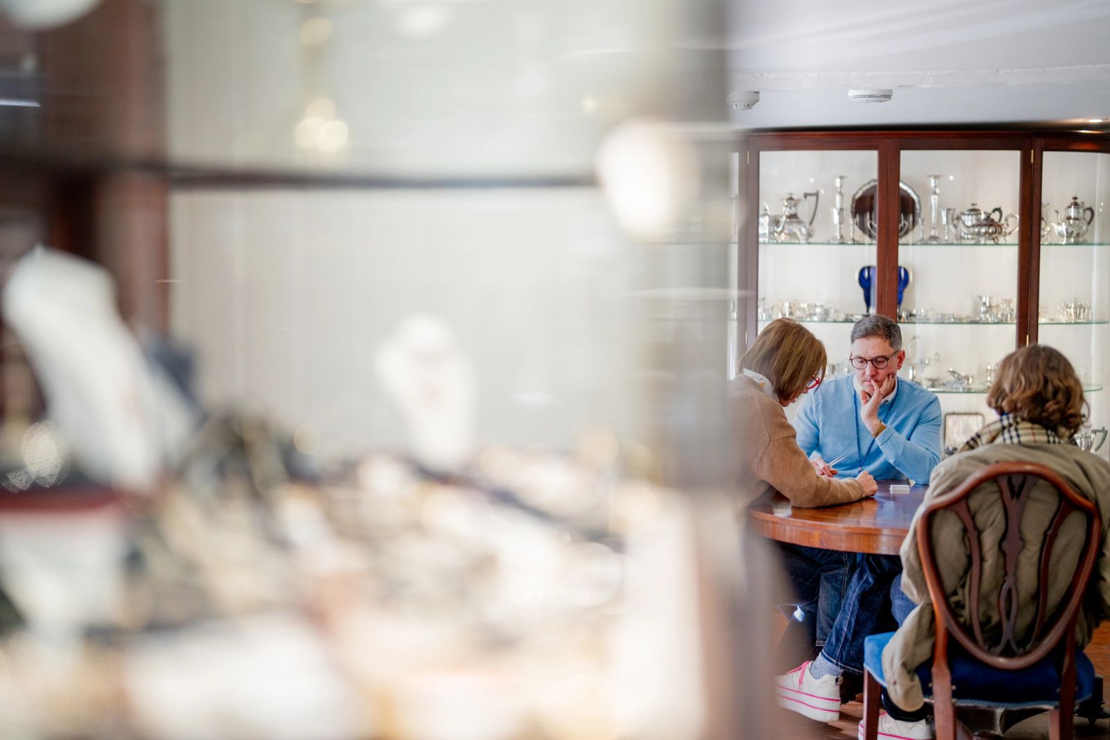
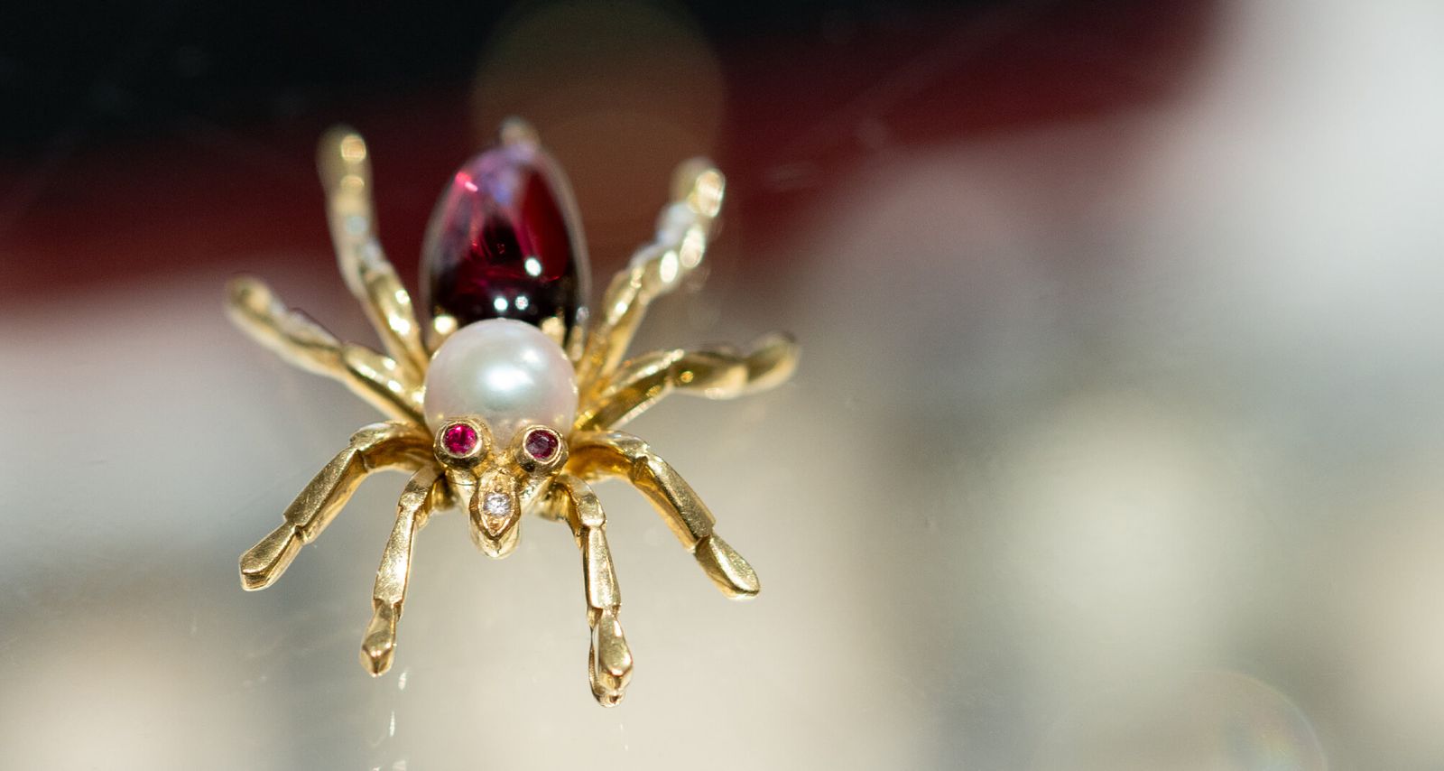
Generations of care, quality, and craft
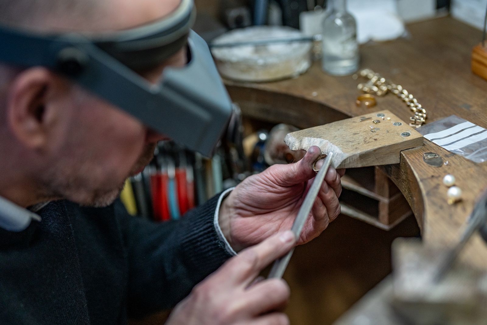
Outthought developed a brand strategy for Webbs centred around their extraordinary commitment to care; indeed, returning customers are treated as old friends, leading to enduring multi-generational relationships.
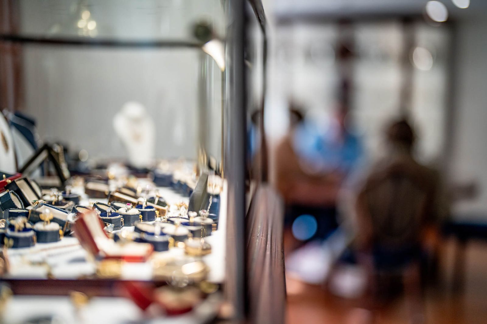
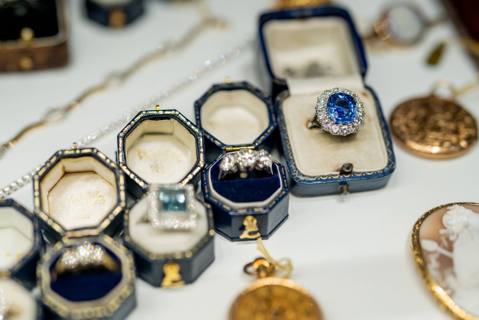
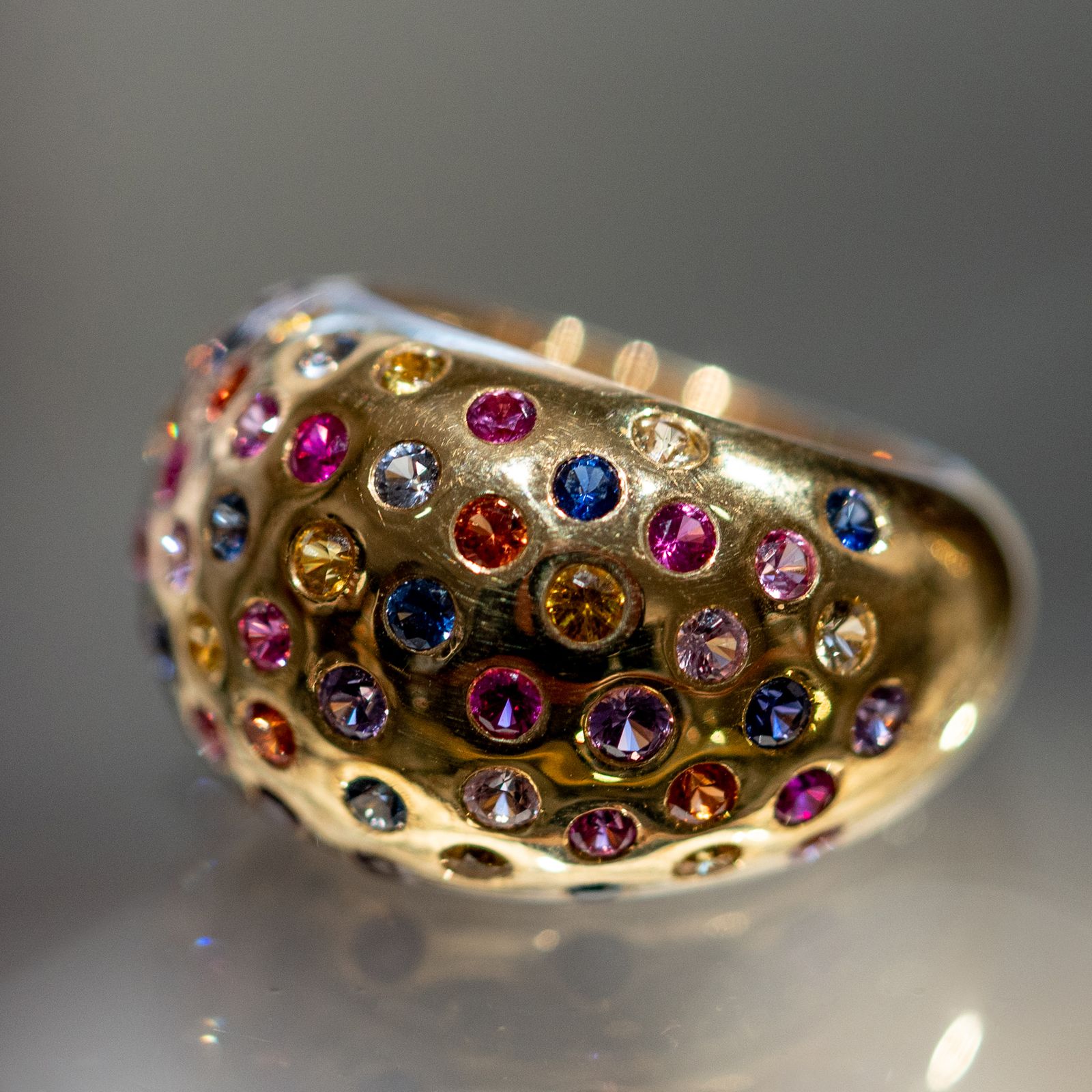
The Holt store and workshop became a central pillar of the strategy, a focal point for the sense of membership that Webbs customers experience. An extensive photo and video shoot was carefully art-directed to immerse more remote online customers in the Webbs universe.
Refinement refreshed
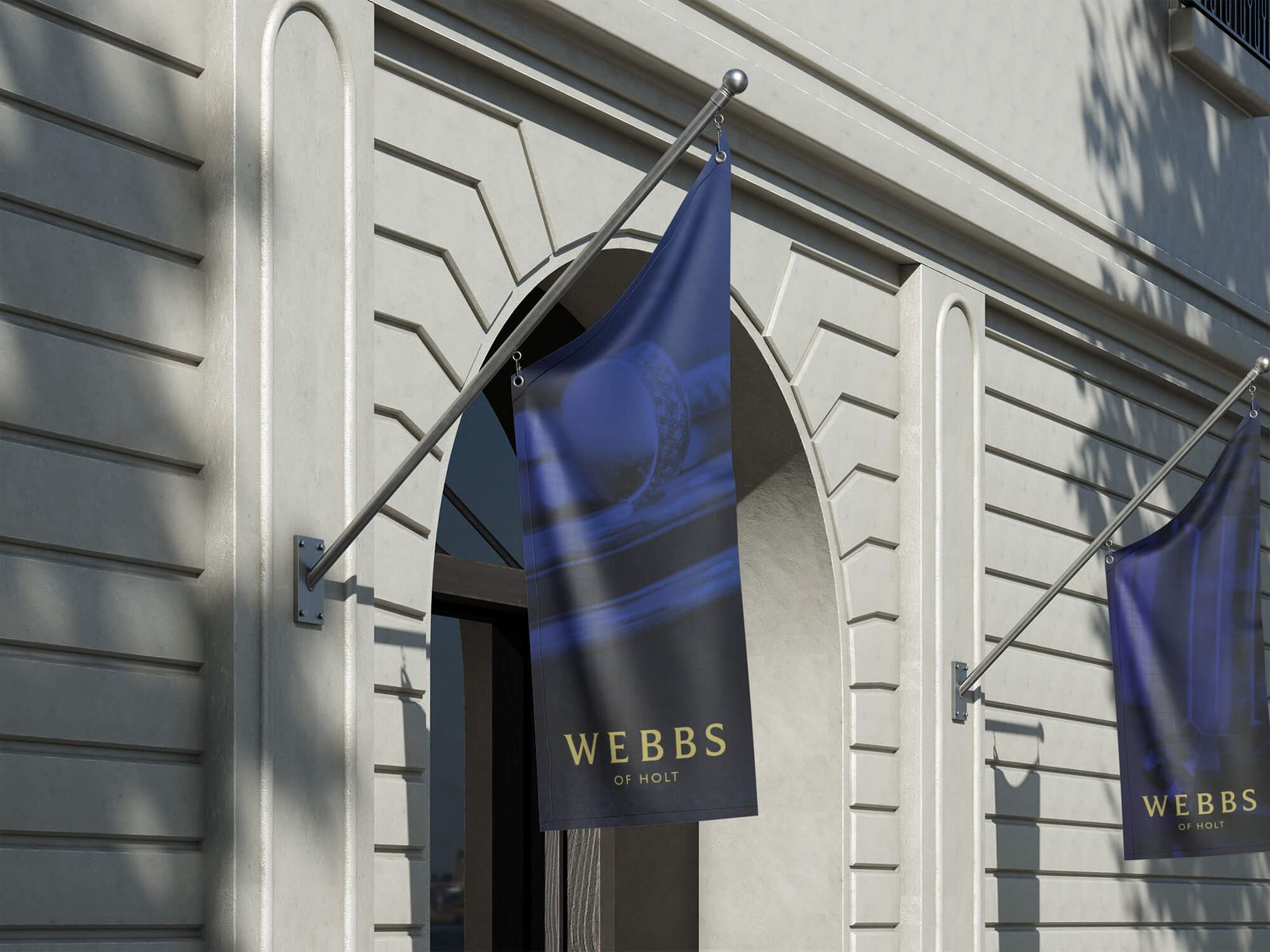
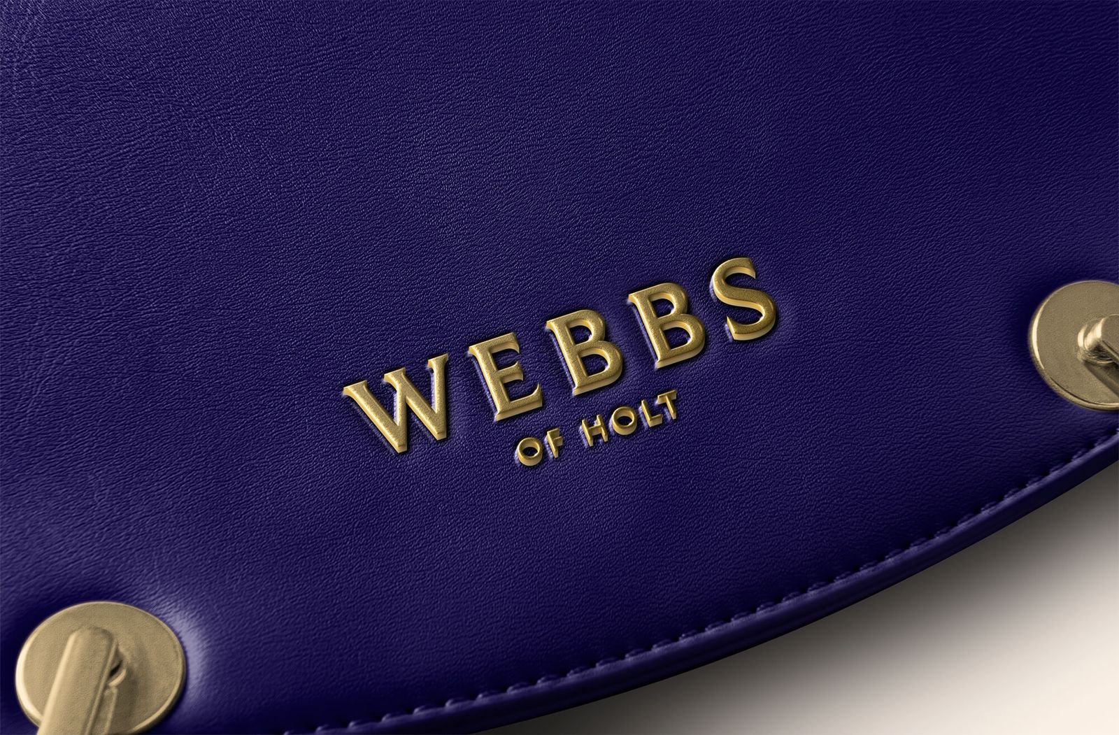
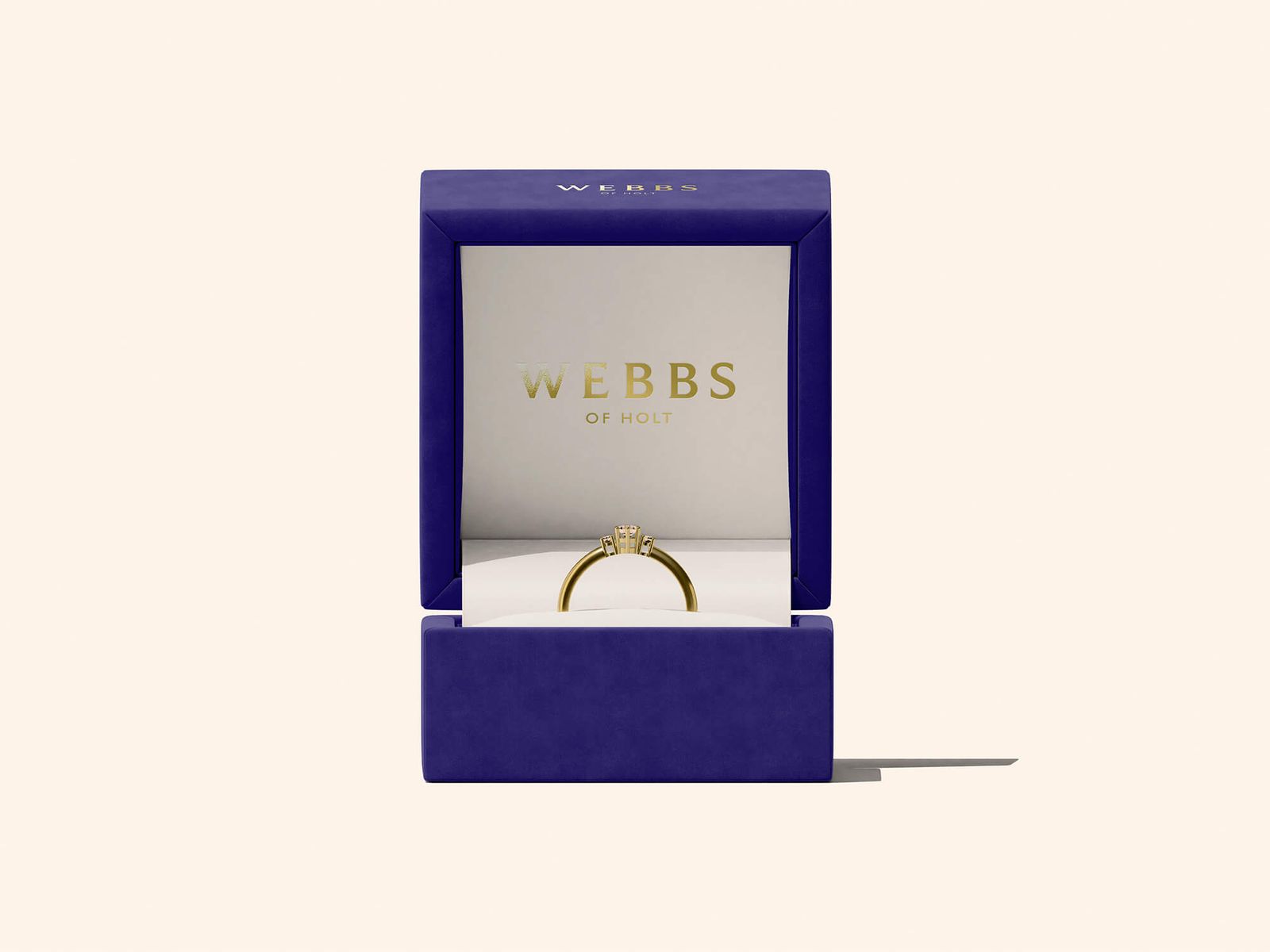
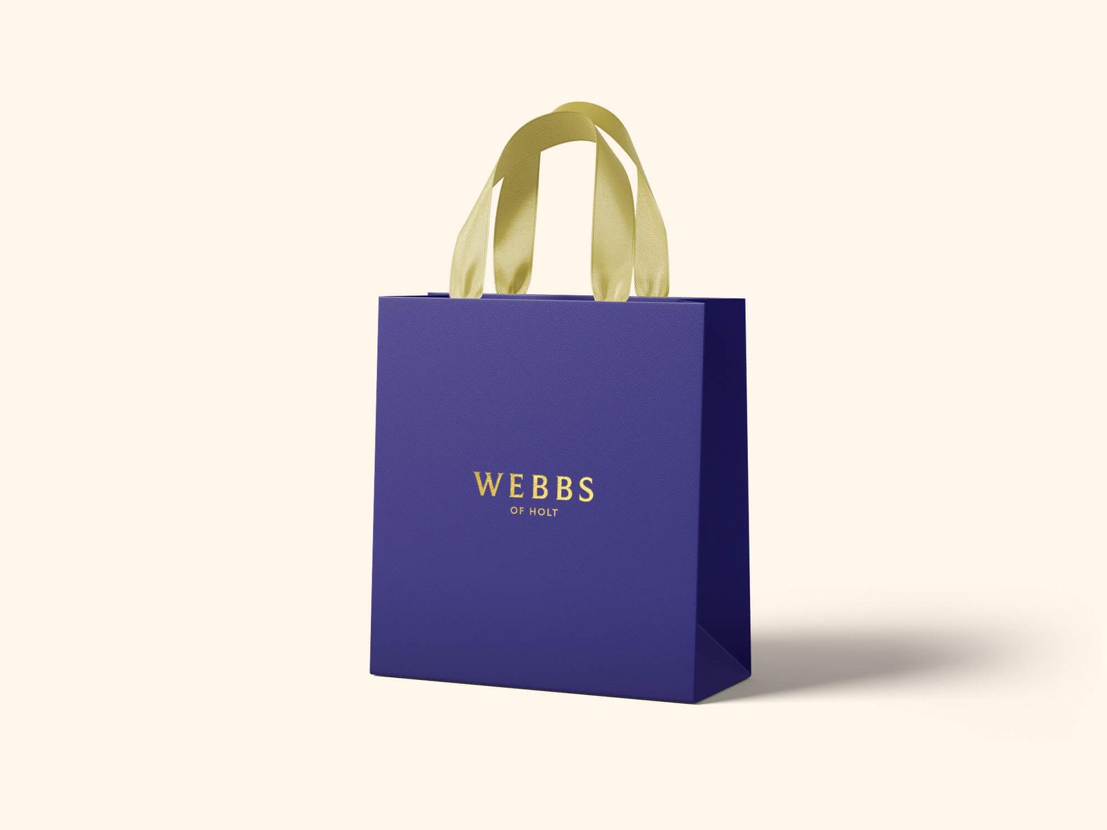
A refresh and refinement of the Webbs typographic mark was undertaken, adding the ‘Of Holt’ identifier to centre the store location within the overall visual identity. A simplified colour palette with an ownable ‘Webbs Blue’, akin to ‘Liberty London purple’, was introduced, and the refreshed brand rolled out across multiple touch-points, including the Webbs Shopify-powered ecommerce website.


The mesmerising colours of gemstones catching the light, the precision of well-worn tools, and the countless stories that filled our workshop loom large in my childhood memories. My father, Nick, founder of Webbs, passed on a legacy of care, precision, and unwavering attention to detail, and we're very proud to be able to communicate that to our customers.