COMPLEX INFORMATION ➞ DOCUMENT DESIGN ➞ PRINT COLLATERAL ➞ TYPOGRAPHIC CONSULTANCY ➞ ADVERTISINGS ➞
Barratt & Cooke
Established in 1880, Barratt & Cooke is one of the UK’s oldest family-run firms of investment managers. In 2022 the firm embarked on a project to update and modernise their brand.
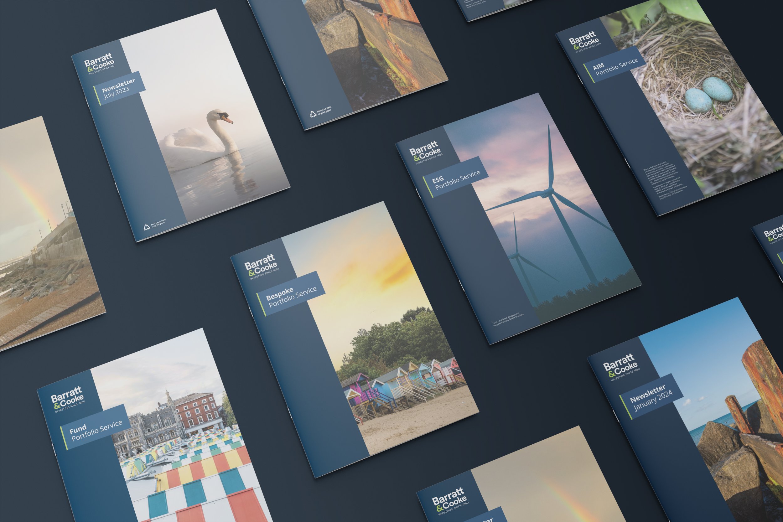
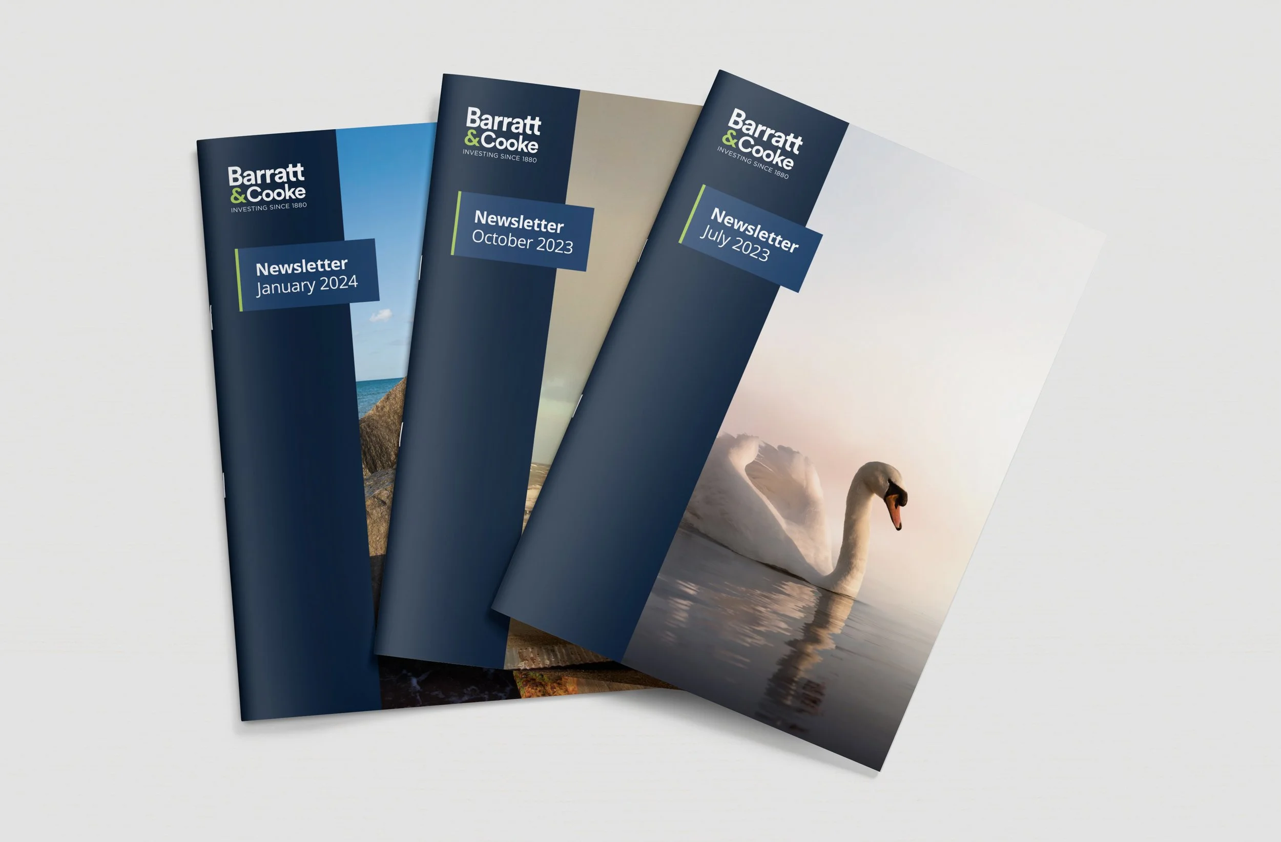
Having commissioned a London-based agency to create a new logo, colour palette, and website, Barratt & Cooke turned to Outthought to expand and roll out the new brand. Outthought designed and produced a rationalised set of typographic / layout conventions and styles to be applied across a suite of fund prospectus, quarterly newsletters, print advertising, and display.
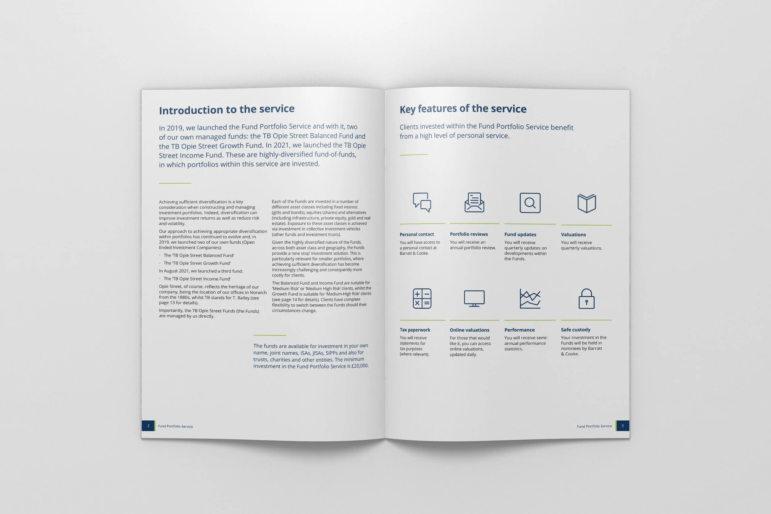
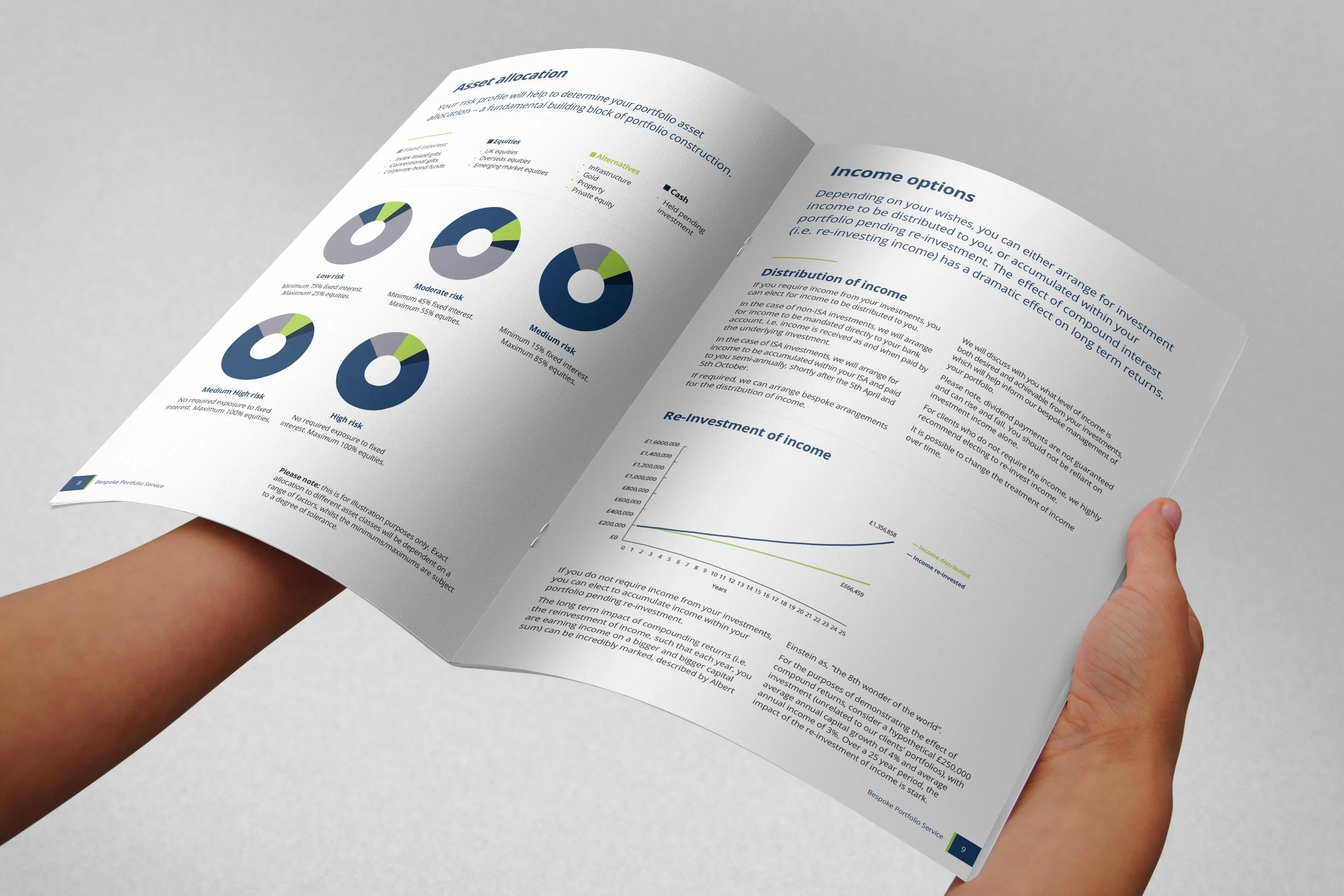
An additional, vital element of the project was the redesign of an extensive suite of templated forms, questionnaires, and key financial documents that sit at the core of Barratt & Cooke’s business processes and client relationships as the most common point of interaction between the company and its customers.
Putting complexity out of business
With a modernised logo and visual language ready to roll out Barratt & Cooke initially approached Outthought to take on the not-insignificant task of addressing a slight oversight on the part of their former agency… The 300+ forms and documents that are at the core of their business.
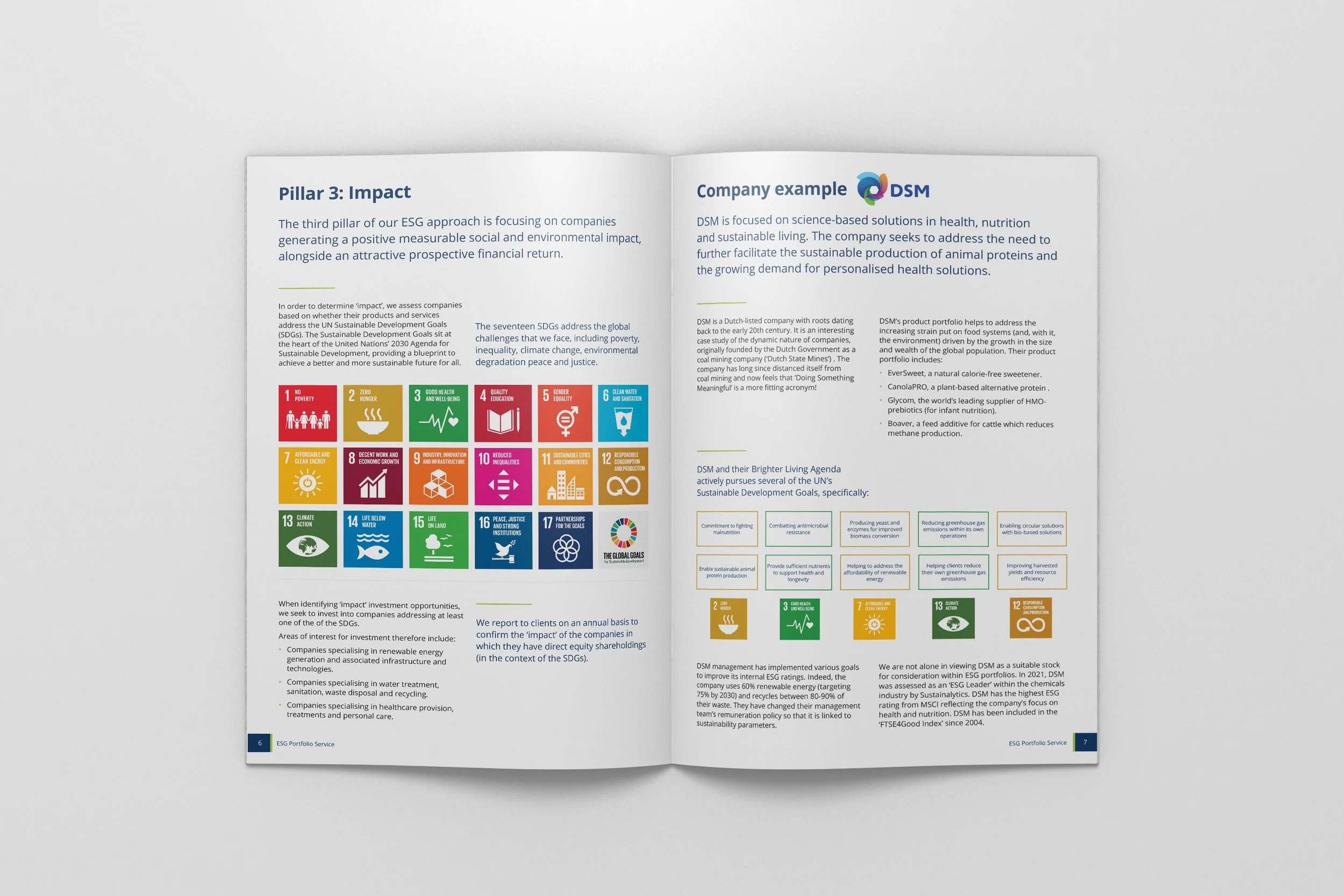
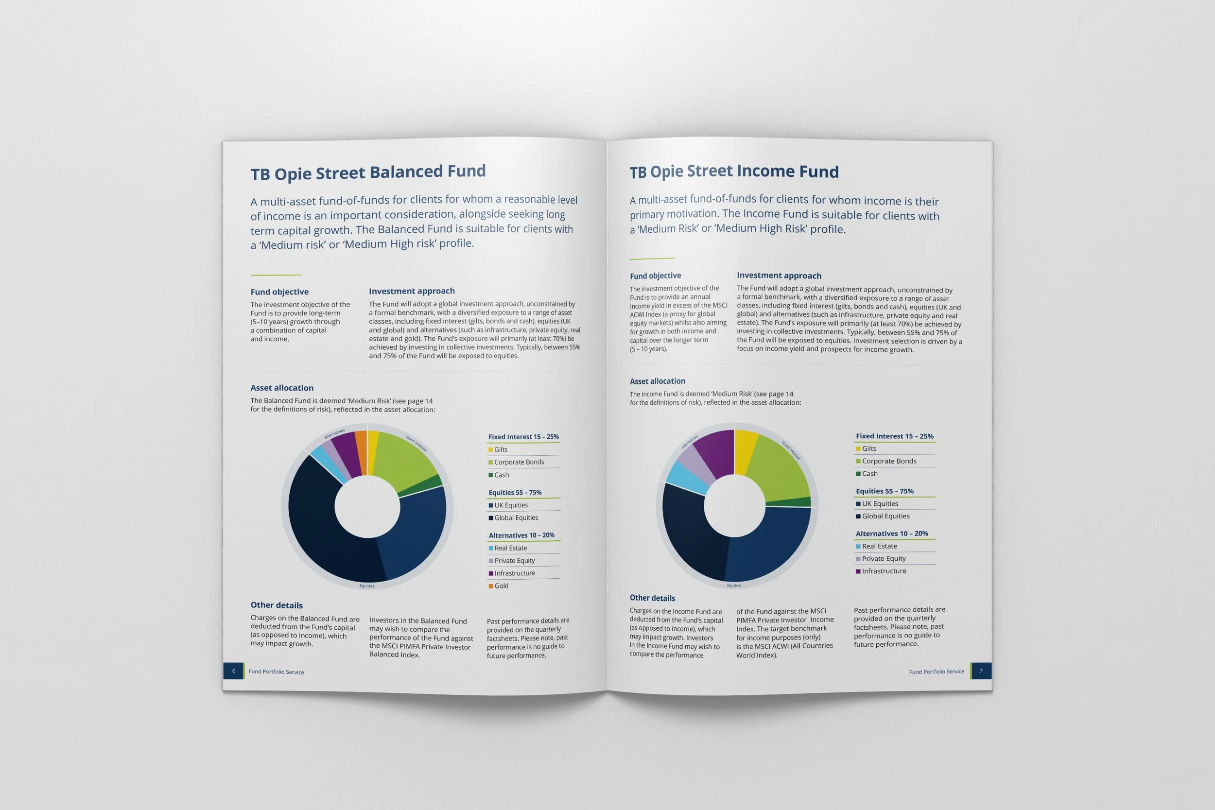
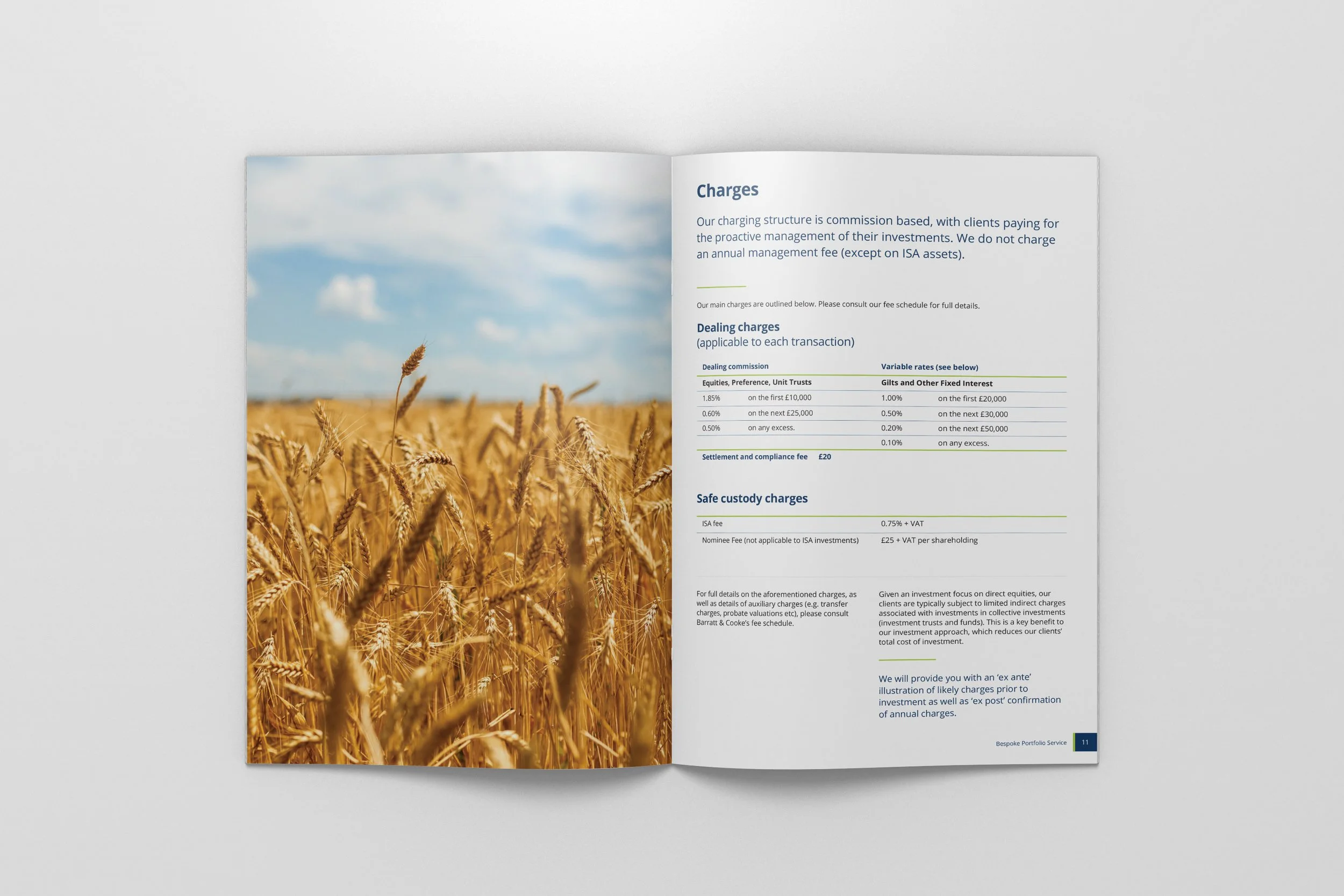
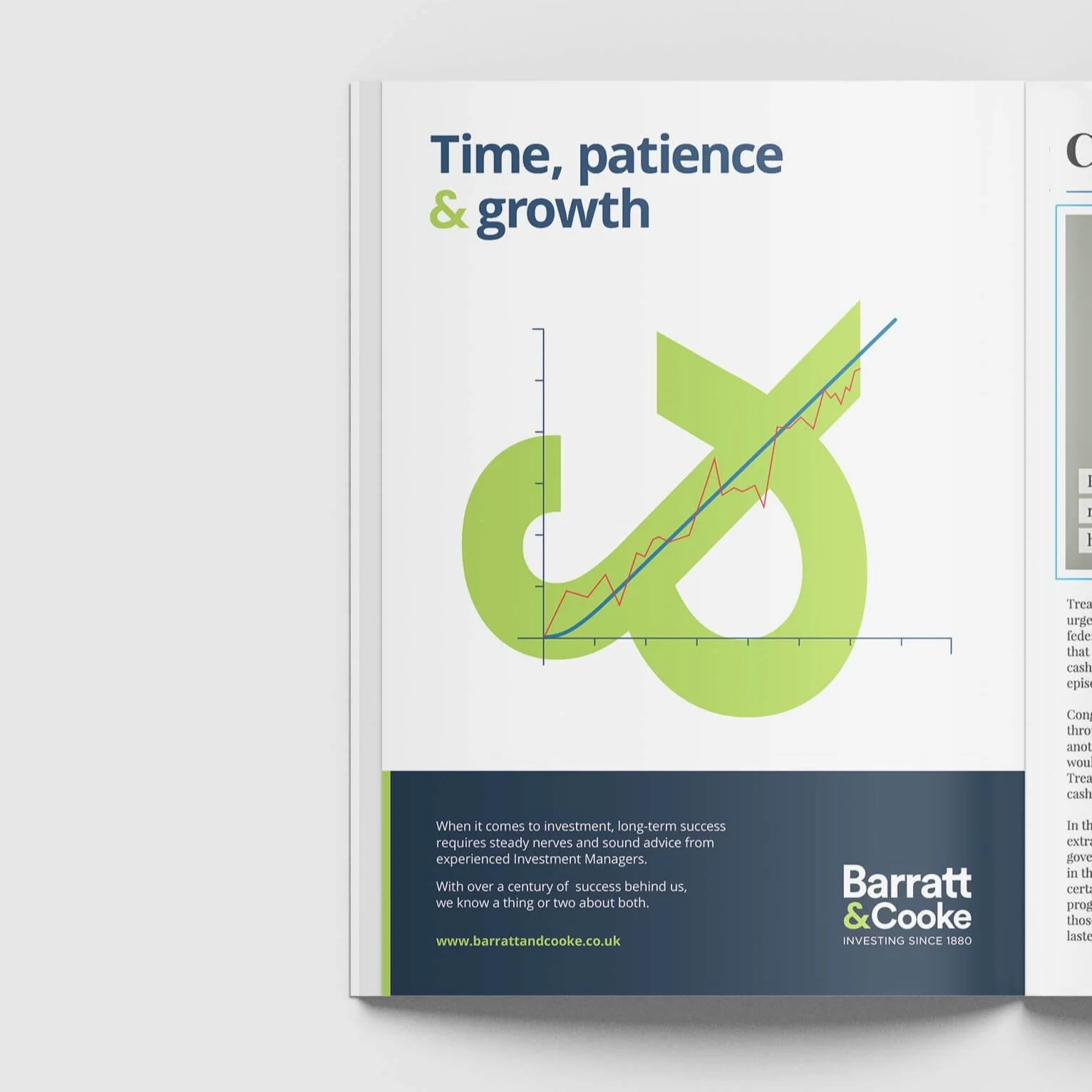
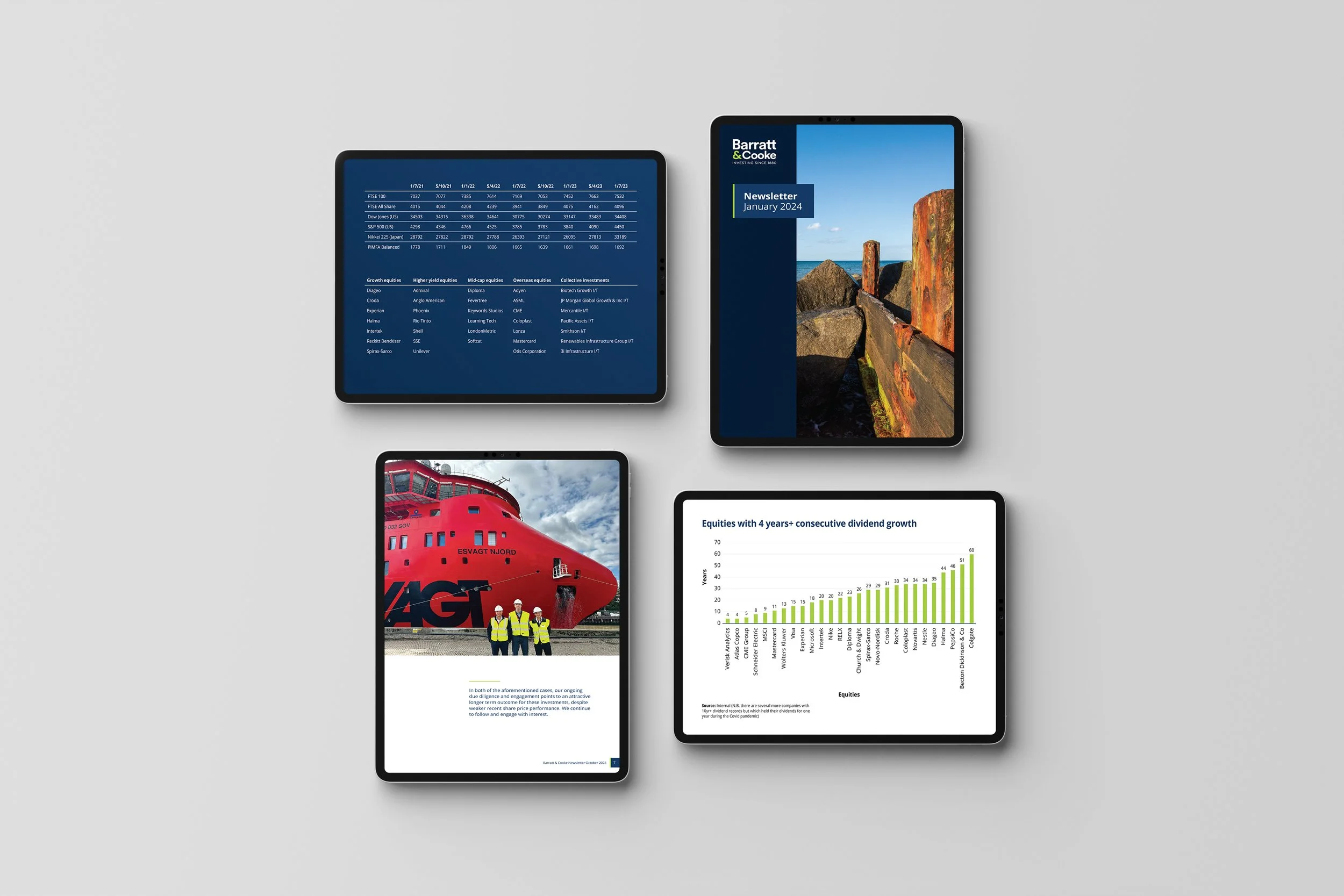
Outthought’s approach was not only to bring this extensive document suite in line with the new identity but to actively reduce the inherent complexity for customers by applying consistent and considered typographic styling and information design principles. The success of Outthought’s work on the technical elements led to an expanded brief taking in advertising executions, design of investment prospectuses and ongoing provision for Barratt & Cookes quarterly newsletter update print and digital publications.


➞➞